Table of Contents
Every time someone mentioned pivot tables, my freelancer friend Jamie would break out in a cold sweat. Excel made his brain hurt, and the phrase “data-driven decision-making” in meetings had him reaching for a third cup of coffee.
Fast forward five years? Companies now pay him ridiculous amounts to dig through their data and tell them what’s actually going on with their business. And no, he doesn’t have some fancy data science degree or math background (he was an English major, for crying out loud).
So how did he transition from being spreadsheet-phobic to becoming a data consultant? I’ve watched several friends make this transformation, and I’m sharing their real stories today. No jargon, no pretending it’s rocket science, just the real skills that transformed their career options – and could do the same for you.
Spoiler alert: it was way easier than they thought it would be!

It’s Not About Math, It’s About Detective Work
How These Freelancers Learned to Stop Worrying and Love the Data
The big secret nobody tells you: becoming good with data isn’t about memorising formulas or coding like a Silicon Valley wunderkind. It’s about developing a detective’s mindset.
Take my Zinner friend Sophia. Her first big win wasn’t because she did some sophisticated analysis. It happened because she was nosy enough to ask, “Wait, why are Tuesday’s sales always higher than Saturday’s? That seems backwards.”
Turns out the company had been running a Tuesday email promotion for THREE YEARS, and nobody had bothered to check if it was scheduled on the right day. They moved the email promotion to Friday, resulting in an instant revenue increase. Her client thought she was a genius, but she just asked an obvious question no one else had bothered with.
That’s when she realised something crucial: most people are so intimidated by data that they don’t even look at it critically. They just accept whatever trends the reporting tool spits out.
Learn to question the data: Where did it come from? Who collected it? What’s missing? And you’re already ahead of 90% of your colleagues.

Nobody Cares About Data (They Care About Answers)
Another freelancer friend of mine, Alex, learnt this lesson the hard way. He spent weeks creating a gorgeous 30-page report with colour-coded charts for a retail client that nobody – and he means NOBODY – ever read. His client flipped to the final page and said, “So what should we do differently?” and Alex had no clear answer. Ouch!
Since then, he has followed a straightforward strategy that he shared with me for the attention of Zinners.
- Find out what keeps decision-makers awake at night. For his e-commerce clients, it’s usually “Why are customers abandoning their carts?” or “Which products should we discontinue?”
- Work backwards from there. If they’re worried about cart abandonment, he needs checkout funnel data, not general traffic stats.
- Keep a Post-it note next to his computer with: “What specific action should they take based on this analysis?” If he is unable to articulate a clear response, the task remains incomplete.
This approach has saved Alex countless hours analysing stuff nobody cares about. And counterintuitively, it’s made his analyses much simpler. Often the answer to a burning business question doesn’t require complex statistics – just the right slice of data examined through the right lens.

The Actual Skills That Got My Friends Hired (And Made Them Money)
Look, there are a gazillion data skills you COULD learn. But you don’t need most of them to start making an impact. Here are the ones that actually moved the needle for the freelancers and remote workers I know:
Spreadsheet Magic That Impressed Their Clients
Excel may not be glamorous, but it serves its purpose. Five formulas changed my friend’s working life:
- VLOOKUP: Made him look like a wizard by connecting customer names to their past purchases. His client had been doing this manually—yikes! Excel Easy’s VLOOKUP tutorial (very beginner-friendly)
- PivotTables: Transformed a 10,000-row customer list into clear insights in 3 minutes. Pro tip from Taylor: “Learn to drag-and-drop in PivotTables before you tackle the more advanced stuff.” Excel Easy’s PivotTable tutorial (very beginner-friendly)
- COUNTIFS: Answered the question “How many customers bought Product X but not Product Y?” in seconds instead of hours. Ablebits’ COUNTIFS guide (beginner-friendly)
- Text-to-columns: Saved him from manually separating first and last names in a contact list. This feature alone probably saved him 2-3 days of mind-numbing copying and pasting over his career. Excel Easy’s Text to Columns guide (very beginner-friendly)
- Simple IF statements: Let him automaticallycategorisee customers as “high-value” or “at-risk” based on theirbehaviour. Anyone can learn this in 15 minutes. Microsoft’s official IF function documentation (very beginner-friendly)
None of this is rocket science. You could learn these five things in a weekend and instantly become more valuable at work.

Data Visualisation (Or How My Friend Stopped Making Ugly Charts)
Madison used to create the world’s most hideous Excel charts – 3D pie charts with every colour of the rainbow. She still cringes thinking about them.
Then she read “Storytelling with Data” by Cole Nussbaumer Knaflic (life-changing, she says) and learnt a few basic principles:
- Less is more: strip away everything that isn’t helping make your point. Grid lines, borders, unnecessary labels – gone.
- One chart, one message: If you’re trying to show three different insights, use three different charts.
- Use colour sparingly: use grey for most data, then highlight the important stuff in a contrasting colour.
Just these few tweaks made her presentations look immediately more professional. People started saying things like, “Wow, this is so clear!” instead of squinting in confusion at her slides.

Actually Understanding Basic Statistics (Finally!)
My uni friend avoided statistics like the plague until a client called him out for not knowing the difference between average and median home prices (embarrassing!).
Turns out, you only need to understand a handful of concepts to sound smart in meetings:
- Mean vs. Median: Median house price ($300k) can be way more useful than average ($450k) when a few mansion sales are skewing your data. This one insight has helped Damon avoid countless bad business decisions.
- Correlation vs. Causation: Just because ice cream sales and drowning deaths both increase in the summer, that doesn’t mean ice cream causes drowning. Understanding the facts saved him from making some truly stupid recommendations.
- Statistical Significance: Knowing when a pattern is real vs. random chance. He once stopped a client from completely overhauling their website based on the behaviour of just 12 visitors!
Transforming Raw Data into Insights
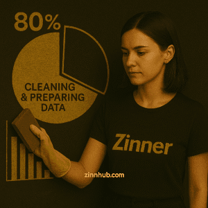
The Data Cleaning Process
Data professionals often report spending up to 80% of their time cleaning and preparing data. This unglamorous but essential process includes:
- Removing duplicate entries
- Handling missing values
- Standardising formats (dates, currencies, etc.)
- Correcting obvious errors
Reliable analysis relies on clean data – the adage “garbage in, garbage out” applies here.
From Analysis to Insight
The real value in data analysis comes from connecting numbers to real-world implications. This means:
- Identifying patterns and anomalies
- Comparing results against benchmarks or historical performance
- Synthesising findings into a coherent story
- Translating analytical conclusions into business recommendations
Presenting Your Analysis Effectively
Data Storytelling Techniques
The most sophisticated analysis is worthless if you can’t communicate your findings effectively. Data storytelling combines:
- A clear narrative structure (setup, conflict, resolution)
- Strategic use of data visualisations
- Relatable context that connects to stakeholders’ priorities
Remember that different audiences need different levels of detail. Executives may want only the high-level implications, while operational teams might need more granular insights.
Creating Compelling Data Reports
Well-designed reports make your analysis accessible and actionable. Key elements include:
- An executive summary highlighting key findings
- Visual hierarchy that guides readers through important points
- Interactive elements that allow exploration (when appropriate)
- Clear recommendations based on your findings

Tools These Freelancers Actually Use (Not Just The Ones That Sound Impressive)
Everyone has opinions about data analysis tools. Most articles list dozens you “need to learn”. But the freelancers I know have built their entire businesses on just a handful of tools that get the job done without melting their brains.
Their Everyday Toolkit
- Google Sheets: Not Excel?? That’s what my remote worker friend Liam says. For 90% of his client work, Google Sheets wins because of real-time collaboration. He can hop on a call, share his screen, and they can both edit the analysis together. The IMPORTRANGE function also lets him pull data from one client sheet to another – a game changer for dashboards.
- Looker Studio (formerly Google Data Studio): Emma resisted learning this for WAY too long. Now she uses it weekly. The free version connects to everything from Google Analytics to Sheets to ad platforms. Her clients think she’s a genius when she turns their messy data into a dashboard that updates automatically.
- Tableau Public: When Ryan needs to create something more visually impressive for presentations or reports, Tableau is his go-to. The learning curve made him cry actual tears of frustration, but pushing through those first few weeks was worth it. His highest-paying clients came after seeing his Tableau portfolio pieces.
- Airtable: My friend Jess says it’s like spreadsheets and databases had a beautiful baby. She uses it to organise complex projects and datasets that would be a nightmare in regular spreadsheets. The views feature is magic – the same data can be shown as a calendar, kanban board, or gallery.
- Zapier: Not strictly a data tool, but top freelancer Daniel tells me he uses it to connect all his other tools together. Data flowing automatically from a client’s form submissions into a spreadsheet, then into a dashboard? Chef’s kiss. He insists that it is worth every penny of the $30/month.
- Mixpanel: My product-focused friend Alicia swears by this for tracking user behaviour. She says it’s much easier to use than Google Analytics for answering specific questions like “How many people completed this specific sequence of actions?” Her startup clients love the clear conversion funnels she builds.
- Notion: Sophie uses this for tracking her actual analysis process. She creates databases to log client requests, analysis steps, and findings – basically documenting her entire workflow. She shares specific views with clients so they can see the status of their requests. “It keeps me from repeating work and helps me justify my rates,” she told me.
- Microsoft Power Automate: For Windows-heavy environments, Dave who is currently travelling in Thailand, uses this to automate repetitive data tasks. He sets up flows that extract data from emails, clean it up, and add it to tracking spreadsheets without manual intervention – freeing him up for actual analysis.
- Plausible Analytics: “The privacy-focused alternative to Google Analytics,” according to my good friend Leo, who specialises in working with European clients concerned about GDPR. He loves the clean interface and says it focuses on the metrics that actually matter without overwhelming clients.
- Hotjar: For tracking website user behaviour specifically, Carlos calls this “as close to mind-reading as you can get.” He uses the heatmaps and session recordings to show clients exactly where users are getting confused or dropping off, which makes his recommendations much more compelling.

When They Need to Level Up
For more complex projects, my more experienced data analysis freelancer friends do sometimes need to pull out bigger guns:
- Python with Pandas: Nia avoided coding for YEARS. Big mistake, she tells me. Turns out Python is nowhere near as hard as she feared. For repetitive data tasks, it’s a lifesaver. She’s not advanced—she basically copy-pastes code from Stack Overflow and modifies it—but it gets the job done.
- SQL: Ken still has a love-hate relationship with SQL. It’s not intuitive to him AT ALL, but nothing beats it for working with large datasets. He learnt the basics through Khan Academy’s free course. Not fun, but necessary.
- R (Rarely): My academic friend Mira only uses this when working with research clients or on statistical projects. The visualisation library ggplot2 makes beautiful charts that impress her more technical clients.
Learning Resources That Actually Helped Them
After wasting hundreds of hours on courses that were too theoretical or advanced, these are the resources my friends actually found useful:
- Seriously, buy “Storytelling with Data” by Cole Nussbaumer Knaflic. Madison re-reads it yearly.
- Google’s free Analytics courses taught Raj more than his college marketing classes.
- Udemy’s “Microsoft Excel – Excel from Beginner to Advanced“ by Kyle Pew. Wait for a sale—you can usually get it for $15, says Alex.
- YouTube channel “Luke Barousse“ breaks down complex data concepts in a way that made sense even to my non-technical friend Jamie.
Here’s the truth: You don’t need 15 tools. You need to get really comfortable with 3 to 5 tools that solve real problems. Master the basics before chasing the fancy stuff.
Real-World Projects to Build Your Portfolio
The best way to develop data analysis skills is through practice with real data. Consider these beginner-friendly project ideas:
- Personal finance analysis: Track and visualise your spending patterns using your own financial data
- Sales dashboard: Create a visualisation of public sales data from Kaggle or other sources
- Social media analytics: Analyse engagement patterns from your own or a company’s social profiles
- Product review analysis: Extract insights from Amazon or other e-commerce reviews
- Public health data exploration: Work with open datasets on topics like COVID-19 or health indicators
Document your process and findings in a blog or GitHub repository to demonstrate your skills to potential employers.

The Remote Work Freedom That Data Skills Bought These Freelancers
My friend Olivia will never forget the day she realised she could take her data skills anywhere. She was sitting in yet another soul-crushing team meeting, watching the clock, when her phone buzzed with an email from a startup founder:
“Can you help us figure out why our conversion rates are tanking? Happy to pay your consulting rate.”
Fast forward three months, and she’d quit her job and lined up enough freelance data work to replace her salary – working 20 fewer hours per week. That was in 2016, way before remote work was cool.
Today, her “office” consists of beachside cafes in Thailand, her parents’ kitchen table during visits home, and most days, her own couch. All because she can do something most people find intimidating: make sense of messy data.
If you’re dreaming about ditching the cubicle life, here are some legit ways my network of freelancer friends are making money with data skills:
Get-Started-Next-Week Data Zinns
- “Fix My Google Analytics”: My buddy Raj says you’d be shocked how many small businesses have completely broken tracking setups. He’s charged £500 for a half-day audit and basic fixes. All he needed was Google’s free Analytics certification.
- “What Should We Post on Social Media?”: My friend Sara turned her marketing background + basic data skills into a side hustle analysing which Instagram content performs best for local businesses. She runs simple analyses in Sheets, creates a neat one-page report, and charges $350 per social audit.
- “Help Me Understand My Customer Survey”: Businesses constantly run surveys, then get overwhelmed by the responses. Being able to categorise open-ended answers, find patterns, and visualise the results is GOLD. My friend Jamie’s first-ever paid project was literally organising 400 survey responses into themes and making three simple charts.
- “Make My Data Look Pretty”: This sounds trivial, but executives HATE ugly spreadsheets and reports. My designer friend Zoe has a whole business taking important but hideous Excel dashboards and transforming them into something visually appealing. She charges €75/hour just to make reports prettier and more usable.
- “Find Out What’s Broken on Our Website”: Carlos uses free tools like Hotjar to watch user behaviour, then analyses where people get stuck or confused. He says it’s honestly fascinating work, and businesses will pay good money to fix conversion problems.

“I’ve Got Some Experience” Money-Makers
- The “Data Therapist”: This is what my friend Miguel calls his favourite role – sitting with small business owners who are drowning in data but don’t know what metrics actually matter. He created a “Data Clarity Session” where he identifies their 3-5 most important numbers and builds a simple tracking system. $1,200 for a half-day session that literally brings some clients to tears of relief.
- Subscription Dashboards: Once she got comfortable with tools like Google Data Studio (now Looker Studio), my colleague Priya started building custom dashboards that automatically update. Clients LOVE not having to manually track their metrics, and she charges a setup fee plus monthly maintenance.
- The “Fractional Analyst”: Many companies need data help but not a full-time person. Tyler has 10-hour-per-month retainers with startups where he’s essentially their part-time data team. He earns a consistent income without requiring a full-time commitment!
- The “Data Translator”: My Zinner associate Aisha sits between technical teams and decision-makers to explain what the data actually means in plain English. This role is GOLD DUST if you have both data skills and communication abilities.
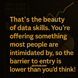
Most of these don’t require fancy degrees or certifications – just demonstrated ability to solve real problems. Miguel’s portfolio started with volunteer projects for a local nonprofit, which led to his first paying clients, which led to… well, telling me this from his mountain cabin instead of an office cubicle.
That’s the beauty of data skills. You’re offering something most people are intimidated by, so the barrier to entry is lower than you’d think!
Continuous Learning and Growth
From Beginner to Intermediate Data Analyst
As you build confidence with basic skills, consider this progression:
- Master spreadsheet functions and basic visualisations
- Learn SQL for data retrieval and manipulation
- Explore either Python or R for more advanced analysis
- Develop specialised skills relevant to your industry
The most successful analysts combine technical knowledge with domain expertise, so leverage what you already know about your industry.
Building Your Data Analysis Network
Learning happens faster in the community. Consider:
- Joining data-focused groups on LinkedIn or Reddit (r/dataisbeautiful, r/dataanalysis)
- Participating in local meetups (virtual or in-person)
- Finding a mentor who can guide your learning journey
- Sharing your work and receiving feedback

Real Data Journeys: From Clueless to Consultant
I hate when articles make everything sound easy and linear. So I asked my freelancer friends to be honest about their messy journeys into data work. Here’s one of my favourite stories from Jamie:
2017: Completely clueless marketing coordinator. Regularly confused mean and median. Got sweaty palms when asked to pull numbers for meetings.
2018: Forced into becoming “the Excel person” when a colleague quit. Spent many late nights Googling “how to vlookup” and “excel formula help please oh god.” Cried in the office bathroom twice.
2019: Created a sales dashboard that caught the attention of the VP. Started getting pulled into meetings he wasn’t qualified to be in. Discovered he could actually explain data in ways that made sense to non-technical people.
2020: Pandemic hit. Company did layoffs. Started freelancing out of desperation, undercharging horribly ($35/hour for what he now charges $125/hour). Learned Tableau through YouTube videos while eating cereal for dinner.
2021: Landed his first “real” data client through a friend of a friend. Still had impostor syndrome daily. Discovered that most companies have AWFUL data practices, and even his basic skills were valuable.
2022: Raised his rates. Lost some clients, gained better ones. Started specialising in e-commerce analytics. Had his first $10k month, then promptly had two months of almost no work and panicked.
2023: Finally hit a groove with a mix of retainer clients and project work. Started teaching basic data visualisation workshops as a new income stream. Realised he’ll always be learning – and that’s actually pretty fun.
Today: Running a profitable data analytics consultancy focused on small to mid-sized e-commerce brands. Still Googles things daily. Still makes mistakes. Still occasionally feels like he doesn’t know what he’s doing – but his clients get tremendous value anyway.
The point is, this journey wasn’t a straight line, and all my freelancer friends are STILL figuring it out. You don’t need to have everything perfectly mapped out. You just need to start, mess up, learn, and keep going.

Practical Advice
If my spreadsheet-phobic friends could go back and give themselves advice, here’s what they’d say:
- Start with ONE project that actually matters to you. Analysing your personal finances, your fantasy football stats, your Spotify listening data – whatever. When you care about the outcome, learning becomes less tedious.
- Don’t try to learn everything at once. Master Excel/Sheets first. Then visualisation. Then maybe SQL. You don’t need Python or R until much later, if ever.
- Make your work visual ASAP. Bad charts are better than no charts when you’re learning. The feedback loop of seeing your analysis visualised helps you improve quickly.
- Find real problems to solve. Offer to help a friend’s small business, a local nonprofit, or a struggling department at your company. Real-world data is messy and complicated in ways tutorials never capture.
- Share what you create. Nothing accelerated my friend Madison’s learning like having to explain her analysis to someone else. It exposes your thinking gaps immediately.
- Don’t compare your chapter 1 to someone else’s chapter 20. Those intimidating data scientists on LinkedIn have been at this for years. Your journey is just beginning.
The beautiful thing about data skills is that the bar is shockingly low. Most businesses are drowning in information but starving for insight. They don’t need advanced machine learning algorithms – they need someone who can tell them which products they should stop selling or why their customers are leaving.
You can be that person much faster than you think.
So, what small data project are you going to start with this week? let the Zinn Hub community know in the comments below.